Marissa Louie
Head of Product and UX Design (consulting); formerly Sr. UX Design Director at Pandora/SiriusXM, UX Director at Expedia
Leadership case studies filed next to product case studies, on purpose.
What they show
A case-study grid where the first two tiles are not products: 'Executive Leadership — SiriusXM & Pandora' and 'PM & Eng Partnership — Expedia'. Product work follows (Expedia homepage, Yahoo search and ad monetization, Apple iOS, an AI chatbot during COVID), then two more leadership-adjacent entries for the design communities she founded (130,000+ members). Below: a client list annotated with funding raised and exits, six testimonials from reports and founders, and a leadership blog with posts on recruiting designers, staffing archetypes and IC-vs-manager tracks. There is a dedicated Values page in the nav.
Why it works at this level
She solves the Director dilemma by refusing to choose. The grid says 'I have done executive leadership, cross-functional partnership, product design and community building, and I consider them the same kind of work.' Putting the leadership tiles first sets the reading order. The client list with exits and valuations attached is a smart move for anyone consulting: it turns logos into outcomes. The testimonials are chosen for range (a report, a peer, a CTO, a CEO), which quietly answers 'what is she like to work with' from four angles.
What to steal
Make 'how I led' a case study with a tile, a title and a page, and put it first. If you're consulting, attach an outcome to every client logo. Choose testimonials for who they come from, not just what they say: one report, one peer, one executive is more convincing than three of any one kind.
What I'd change
One thing I'd push on. Every site here is good; this is the note I'd send the author.
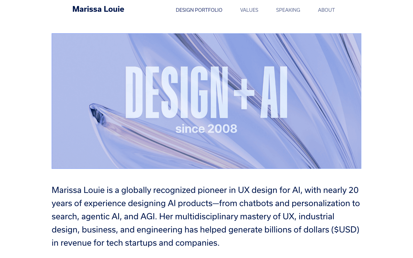
The site is dense, and the AI-pioneer positioning at the top competes with the leadership story in the grid. Picking one primary frame for the first screen would help a visitor know which Marissa they're meeting.